
Creating a sleek, kid-friendly brand for Buckets.
services
Brand Strategy
Branding & Identity Design
Apparel Design
Court & Mural Conception
The mission
Combining the worlds of basketball and golf in a way that appeals to professional trainers as well as families is a challenge. The team at Greenstone needed help navigating this unique space for their new multi-sport facility located in the heart of a family-centric neighborhood. Our mission was to help them appeal to families and get them excited about the space, while also communicating a professional offering to trainers interested in the space.
The outcome
We created the Buckets brand from the ground up, combining the unique worlds of golf and basketball visually in a new logo and brand system. We then took the brand to the next level and applied it to apparel and their physical spaces.

background
A few months before this project we had completed a mural for our local skate-park. The project proved to be a difficult one but helped us get to know Laura Frank and all of the incredible work she's doing with the Liberty Lake Parks & Arts Commission. A few months after the skate-park project ended, Laura reached out to our team because she and her husband Joe had a new branding project they wanted help bringing to life. Joe is the current CEO of Greenstone (a housing developer that's focused on building communities and neighborhoods that people really want to live and grow in). Joe and Laura met with us and shared their vision for a new training facility for basketball and golf, right in the heart of one of their newly developed neighborhoods.
brand strategy
Buckets, a new multi-sport facility in Liberty Lake, aimed to create a unique brand identity that would effectively represent their innovative concept of combining basketball and golf under one roof. They wanted to appeal to both serious athletes and families looking for recreational activities. They really wanted to establish a strong visual presence that would set them apart and attract trainers, golf enthusiasts, and families alike. Their team knew they had to make a good first impression for potential customers and partners, and set the tone for the facility's future success.
Deliverables
Logo and logo variations
Brand graphics
Apparel graphics
Styleguide
Court design concept
Mural design concept
two worlds collide
The main challenge Buckets faced was creating a cohesive brand that could effectively represent two distinct sports - basketball and golf - without favoring one over the other or confusing their target audience. Their team struggled to find a visual language that could communicate the high-performance aspect of their training facilities while also conveying a fun, family-friendly atmosphere.
Initial attempts at developing a logo and brand identity fell short, either leaning too heavily towards one sport or failing to capture the unique proposition of their combined offering. They also grappled with how to visually represent their brand across various touchpoints, from apparel to large-scale installations like court designs and murals.


developing concepts
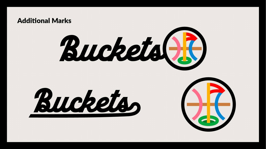
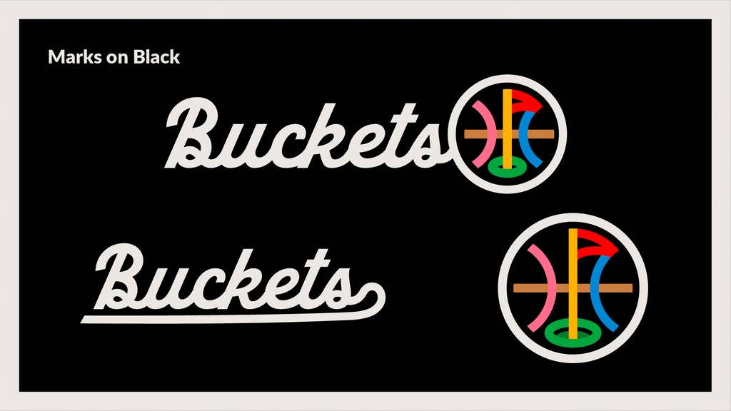
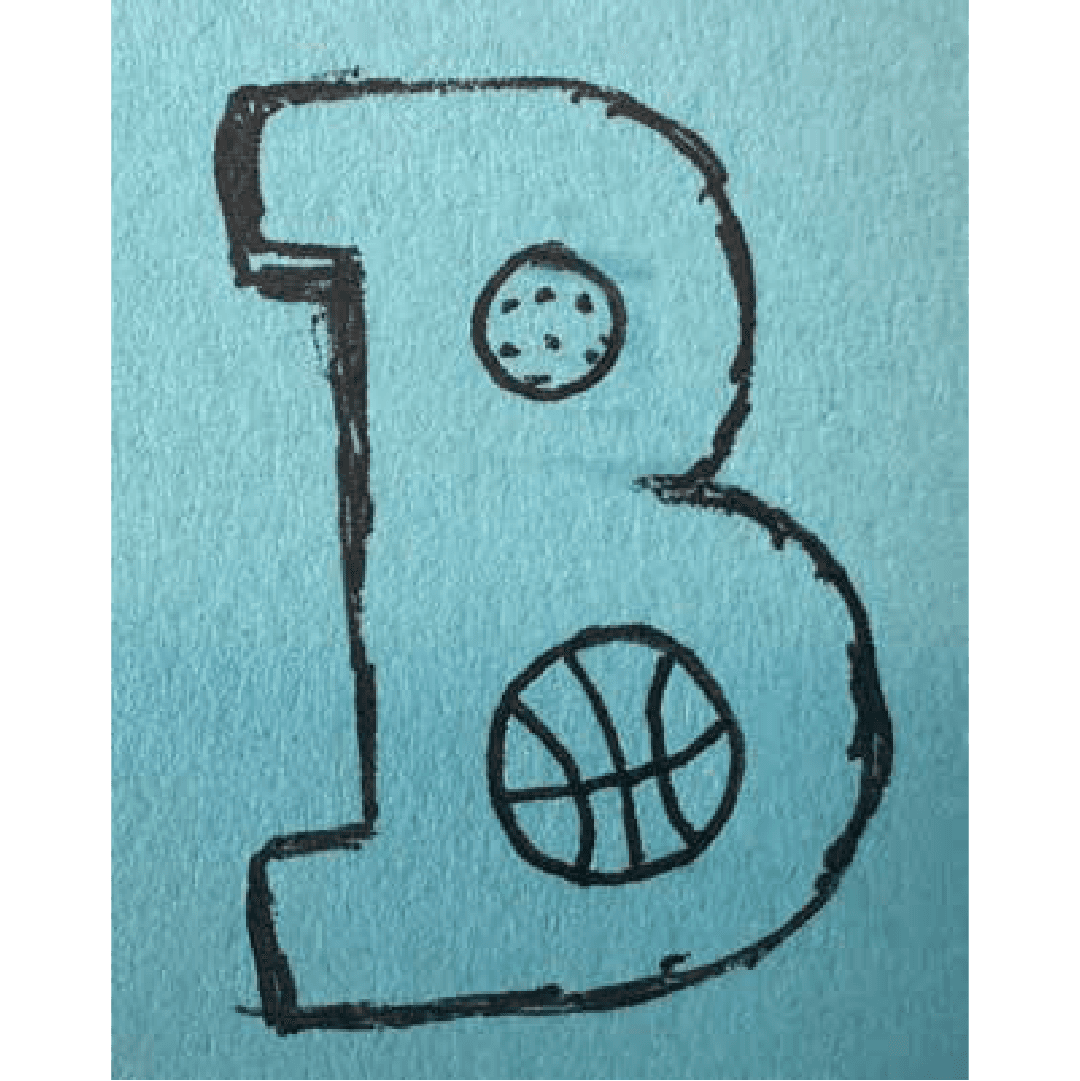
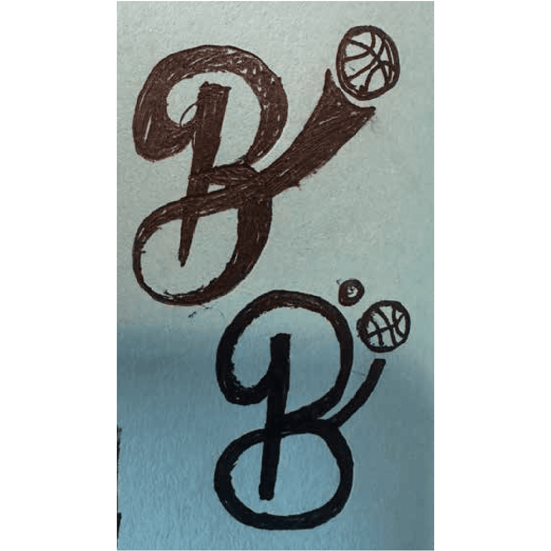
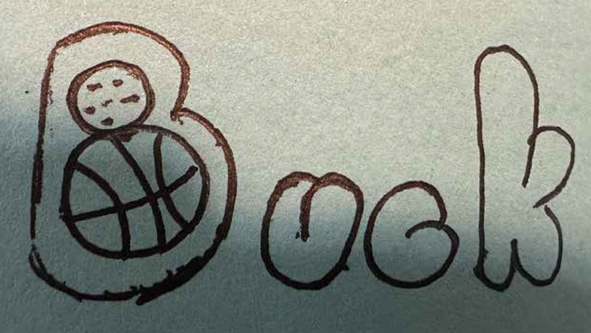
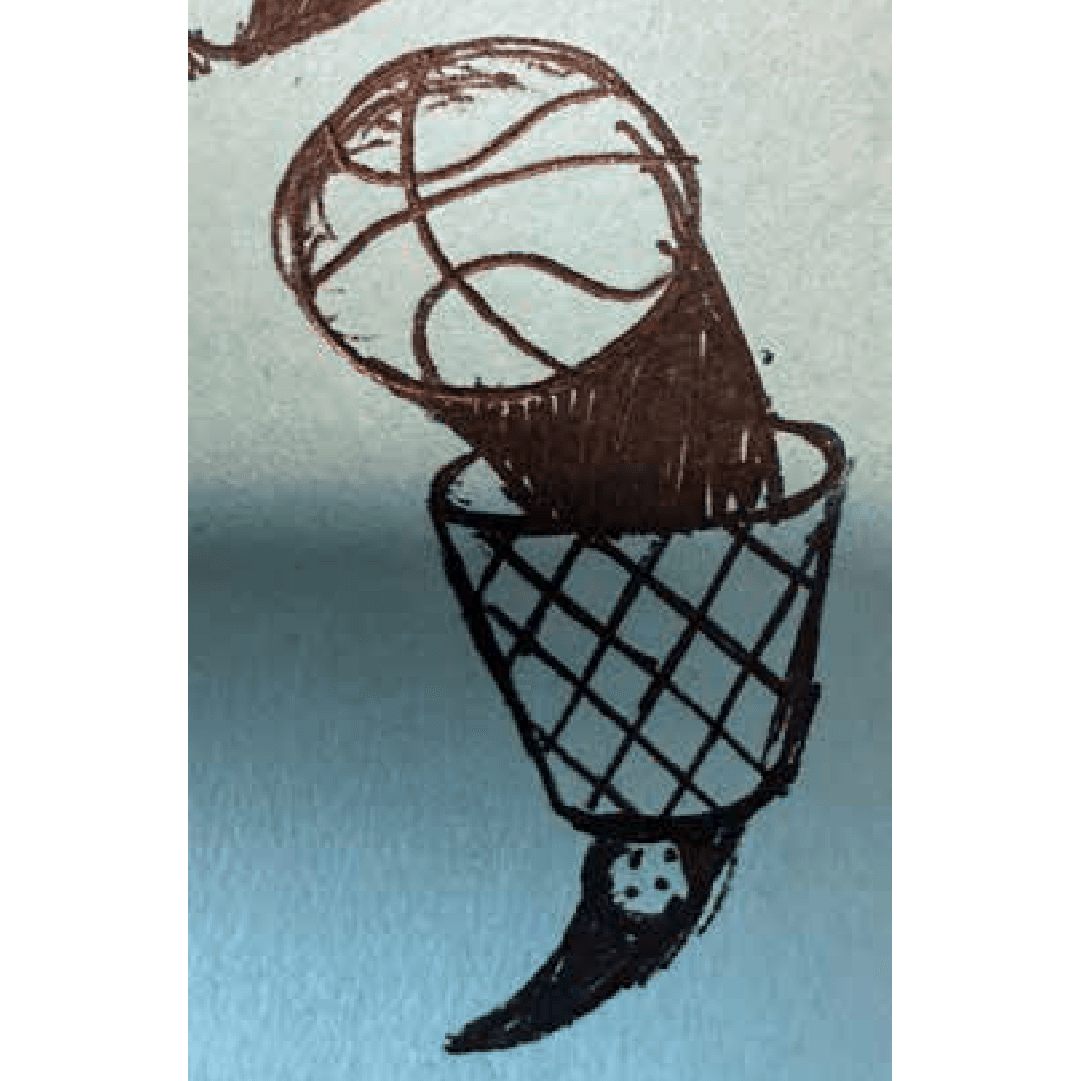
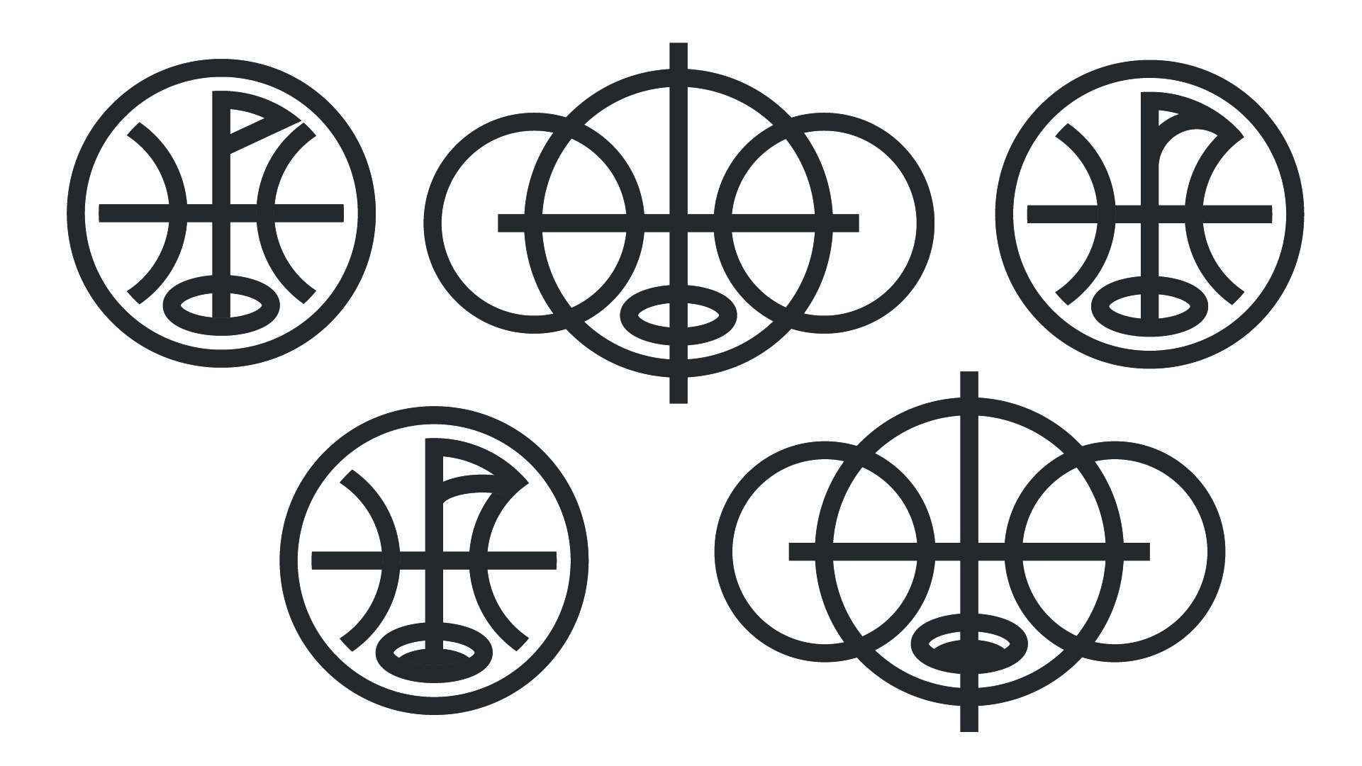
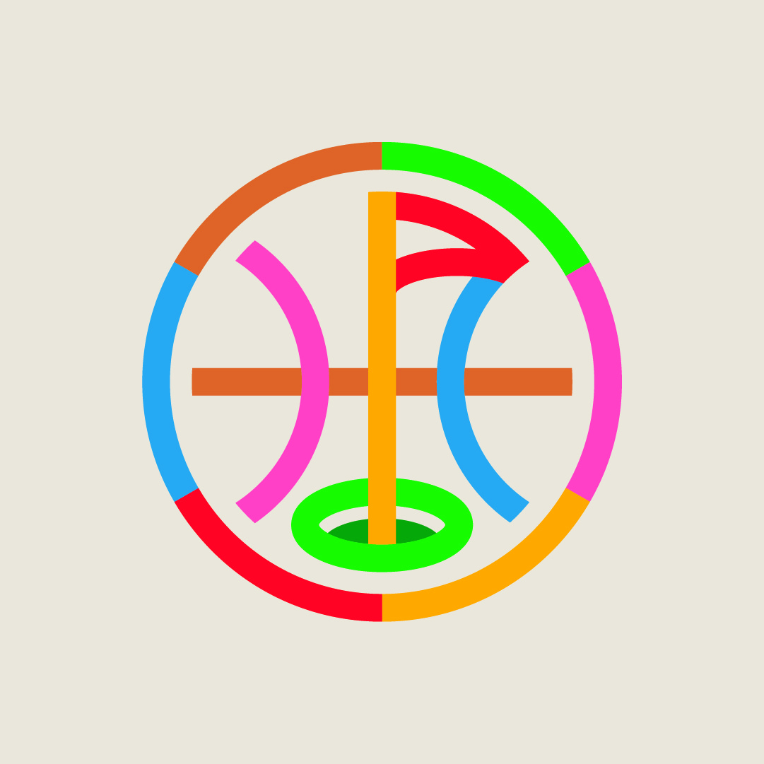
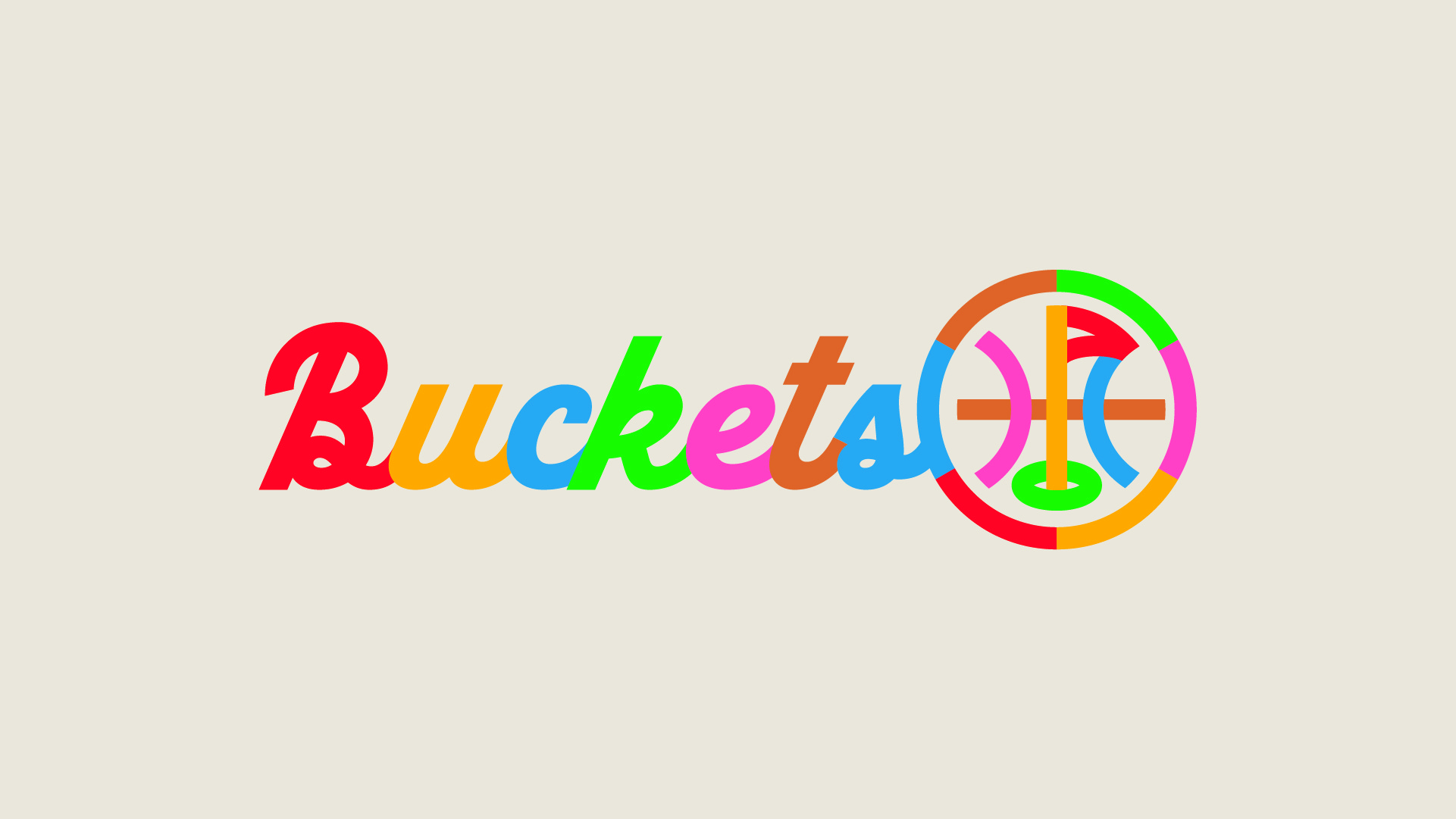
This is when they decided to partner with our team at Lejit Creative. We proposed an integrated approach to their visual identity. Instead of trying to create a visual identity that felt like two singular elements, we suggested focusing on the common element between them - the concept of "buckets" itself, which is slang for scoring in basketball and also relates to the target areas in golf simulators. We initially conceptualized a few different ideas that were centered around a golf ball transforming into a basketball via a bucket (which later ended up becoming a brand element instead). But what we eventually landed on visually was something that married symbols of the two sports, the ball and the flag.

brand identity
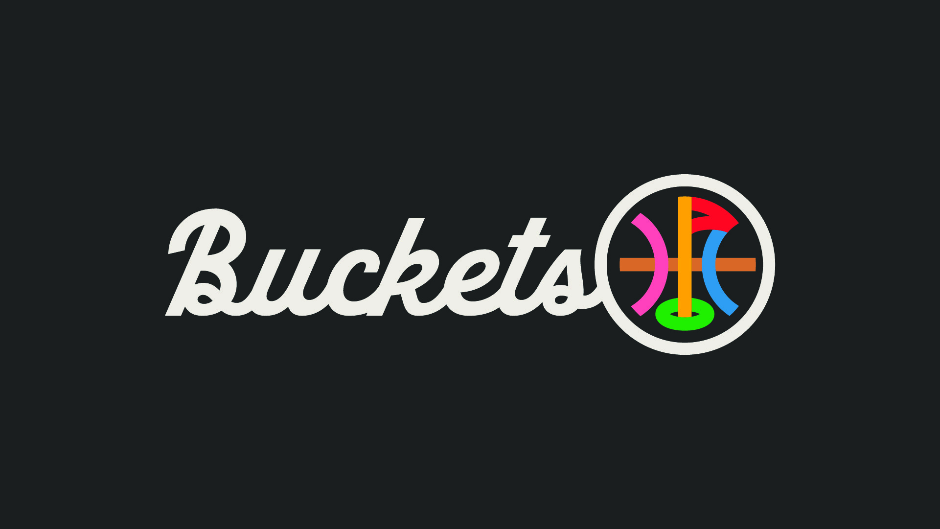
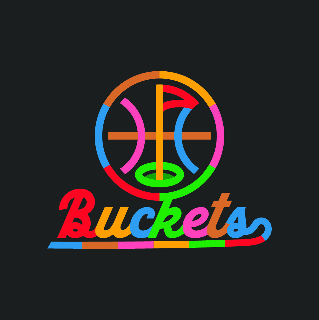
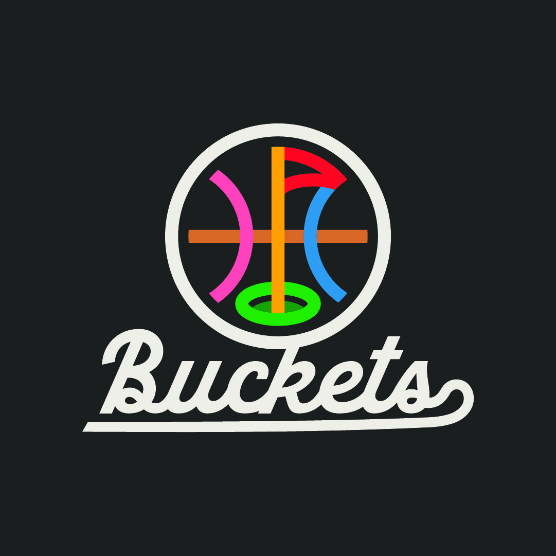
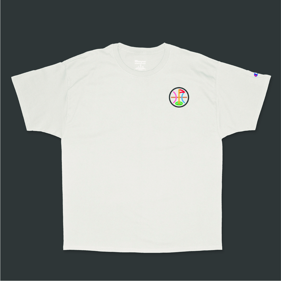
The ball and flag creative direction allowed for a more abstract and versatile brand identity that could work across all applications. Buckets decided to move forward with this concept, investing in a comprehensive branding package that included a new logo, logo variations, brand graphics, apparel designs, a simple style guide, and concepts for court and mural designs. The new chosen direction for Buckets successfully bridged the gap between basketball and golf, creating a cohesive visual identity that appealed to their diverse target audience. The logo and its variations effectively communicated the dual-sport nature of the facility while maintaining a clean, modern aesthetic that worked well across all applications. With the use of color and a monoline script font we grounded the visuals and made them more appealing to families and kids.


expanding the brand
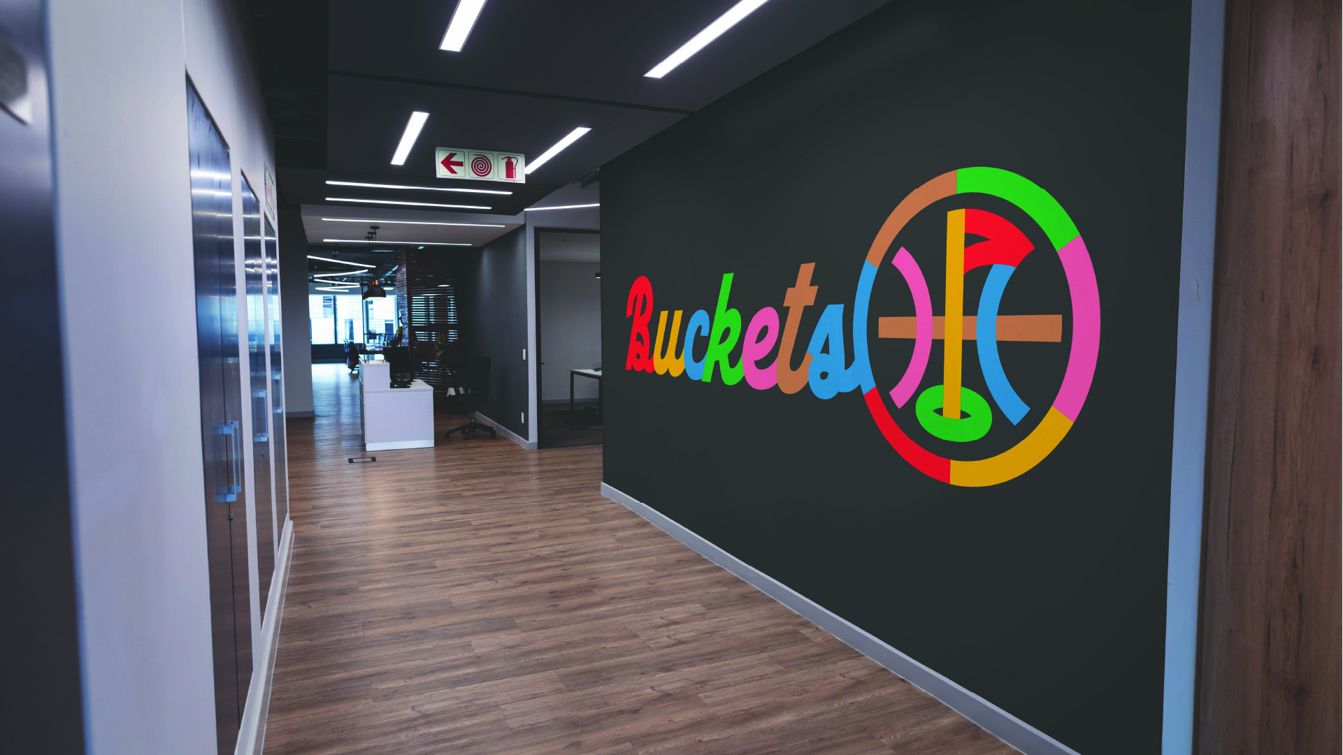
The brand graphics and apparel designs helped create a sense of community and belonging among members and staff. The style guide ensured consistency across all brand touchpoints, from digital presence to physical spaces. The court design concept and mural design added unique, fun elements to the facility, increasing its appeal and memorability.

Launching the brand
As a result of this comprehensive branding effort, Buckets was able to launch with a strong, distinctive identity that set it apart in their market. The new brand successfully attracted both serious athletes and families, helping the facility quickly gain traction in the community. The goal of creating a unique, appealing brand that represented their vision was accomplished, laying a solid foundation for the business's future growth and success.
Client testimonial
Here's what the client had to say about the project!

Laura & Joe Frank
GREENSTONE HOMES
"Josh was incredibly knowledgeable, professional, and fun to work with! He clearly explained the process, took the time to understand our goals, incorporated feedback, and kept us in the loop at every step. We couldn't be happier with the final product and would highly recommend Josh and his team at Lejit Creative!"
Creating a sleek, kid-friendly brand for Buckets.
services
Brand Strategy
Branding & Identity Design
Apparel Design
Court & Mural Conception
The mission
Combining the worlds of basketball and golf in a way that appeals to professional trainers as well as families is a challenge. The team at Greenstone needed help navigating this unique space for their new multi-sport facility located in the heart of a family-centric neighborhood. Our mission was to help them appeal to families and get them excited about the space, while also communicating a professional offering to trainers interested in the space.
The outcome
We created the Buckets brand from the ground up, combining the unique worlds of golf and basketball visually in a new logo and brand system. We then took the brand to the next level and applied it to apparel and their physical spaces.
background
A few months before this project we had completed a mural for our local skate-park. The project proved to be a difficult one but helped us get to know Laura Frank and all of the incredible work she's doing with the Liberty Lake Parks & Arts Commission. A few months after the skate-park project ended, Laura reached out to our team because she and her husband Joe had a new branding project they wanted help bringing to life. Joe is the current CEO of Greenstone (a housing developer that's focused on building communities and neighborhoods that people really want to live and grow in). Joe and Laura met with us and shared their vision for a new training facility for basketball and golf, right in the heart of one of their newly developed neighborhoods.
brand strategy
Buckets, a new multi-sport facility in Liberty Lake, aimed to create a unique brand identity that would effectively represent their innovative concept of combining basketball and golf under one roof. They wanted to appeal to both serious athletes and families looking for recreational activities. They really wanted to establish a strong visual presence that would set them apart and attract trainers, golf enthusiasts, and families alike. Their team knew they had to make a good first impression for potential customers and partners, and set the tone for the facility's future success.
Deliverables
Logo and logo variations
Brand graphics
Apparel graphics
Styleguide
Court design concept
Mural design concept
two worlds collide
The main challenge Buckets faced was creating a cohesive brand that could effectively represent two distinct sports - basketball and golf - without favoring one over the other or confusing their target audience. Their team struggled to find a visual language that could communicate the high-performance aspect of their training facilities while also conveying a fun, family-friendly atmosphere.
Initial attempts at developing a logo and brand identity fell short, either leaning too heavily towards one sport or failing to capture the unique proposition of their combined offering. They also grappled with how to visually represent their brand across various touchpoints, from apparel to large-scale installations like court designs and murals.
developing concepts
This is when they decided to partner with our team at Lejit Creative. We proposed an integrated approach to their visual identity. Instead of trying to create a visual identity that felt like two singular elements, we suggested focusing on the common element between them - the concept of "buckets" itself, which is slang for scoring in basketball and also relates to the target areas in golf simulators. We initially conceptualized a few different ideas that were centered around a golf ball transforming into a basketball via a bucket (which later ended up becoming a brand element instead). But what we eventually landed on visually was something that married symbols of the two sports, the ball and the flag.
brand identity
The ball and flag creative direction allowed for a more abstract and versatile brand identity that could work across all applications. Buckets decided to move forward with this concept, investing in a comprehensive branding package that included a new logo, logo variations, brand graphics, apparel designs, a simple style guide, and concepts for court and mural designs. The new chosen direction for Buckets successfully bridged the gap between basketball and golf, creating a cohesive visual identity that appealed to their diverse target audience. The logo and its variations effectively communicated the dual-sport nature of the facility while maintaining a clean, modern aesthetic that worked well across all applications. With the use of color and a monoline script font we grounded the visuals and made them more appealing to families and kids.
expanding the brand
The brand graphics and apparel designs helped create a sense of community and belonging among members and staff. The style guide ensured consistency across all brand touchpoints, from digital presence to physical spaces. The court design concept and mural design added unique, fun elements to the facility, increasing its appeal and memorability.
Launching the brand
As a result of this comprehensive branding effort, Buckets was able to launch with a strong, distinctive identity that set it apart in their market. The new brand successfully attracted both serious athletes and families, helping the facility quickly gain traction in the community. The goal of creating a unique, appealing brand that represented their vision was accomplished, laying a solid foundation for the business's future growth and success.
Client testimonial
Here's what the client had to say about the project!
Laura & Joe Frank
GREENSTONE HOMES
"Josh was incredibly knowledgeable, professional, and fun to work with! He clearly explained the process, took the time to understand our goals, incorporated feedback, and kept us in the loop at every step. We couldn't be happier with the final product and would highly recommend Josh and his team at Lejit Creative!"